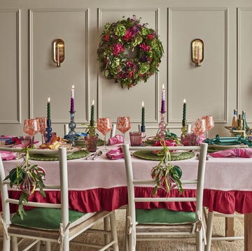
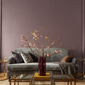
With Greta Gerwig’s Barbie opening in cinemas this summer, pink is everywhere right now. According to the production designer, the movie used so much of the colour for the set that it caused a global paint shortage of a particular vibrant shade of pink.
While the fluorescent pink synonymous with Barbie is probably a step too far for most of us, pink is an excellent choice of paint for the home, according to some of the UK’s top interior designers.
“Pink is a great option because it’s a very flexible colour,” says interior designer Melissa Hutley of Hutley & Humm. “You can use a soft pink as a neutral – it creates a gentle, warm backdrop that’s very flattering and allows your furnishings to speak. Or you can be bolder and go for stronger shades or pair it with more vibrant colours for a very different feel.”
A history of pink paint
“While plaster pinks based on earth pigment have always been popular, crimson-derived pinks as a wall colour have only really been in use since the 18th century,” says architectural historian and interior designer Edward Bulmer. “At that point we started to see them used in ‘ordinary’ – but high status – homes alongside paints made with similarly expensive pigments.”
During the 18th century, innovation and the spread of wealth meant that the costly-to-produce carmine-type pinks became more widely used, although it wasn’t until the second half of the 19th century that paint chemistry allowed a wider range of colours, making brighter shades more democratic.
After the austerity of the second world war, pink exploded onto the scene in the 1950s in film and fashion; in the 1960s, fuscia became synonymous with the pop art movement, and later neon pink with the excesses of the 1980s. More recently we’ve moved through millennial pink to rose quartz to 2023’s Pantone colour of the year Viva Magenta – a ‘powerful and empowering’ hot pink.
“It’s a very enduring colour – every generation reinvents pink to suit themselves,” says interior designer Siobhan Kelly, Associate Director at David Collins Studio.
How to decorate with pink paint
For those keen to add a touch of pink to their homes, the experts we spoke to suggest starting with a soft, blush pink neutral.
“A dusky pink is a very good neutral without the dullness of a white, grey or beige,” says Bulmer. “I particularly like Jonquil by Edward Bulmer Natural Paint – a timeless plaster pink that makes a wonderful backdrop in a period home as well as a modern one.”
“Farrow and Ball’s Dead Salmon and Setting Plaster are both very popular because they’re naturally warm, and look good in all kinds of light,” says Kelly.
For those wanting a bolder look, Hutley suggests using vibrant shades on joinery, lacquered furniture or in a bathroom.
“With a loo, you can get away with a much brighter shade,” she says. “We recently used a colour called Rhubarb by Paint & Paper Library in a client’s bathroom. Paired with a bold wallpaper, it looked very cool.
“Think about what you already have in the room as a starting point,” advises Kelly. “It might be an item of furniture that you love, some beautiful glassware or a piece of artwork. It’s worth drawing from those and considering what pink tones will work with them.”
Don’t forget to consider the ceiling as well as the walls, adds Kelly. “Carrying the colour across the whole ceiling can make a room feel more spacious. With pink I’d be brave and go for it all over.”
Which colours go with pink paint?
“The thing about pink is that you can dial it up or down depending on what you pair it with,” says Kelly. “If you pair it with oranges and reds it evokes passionate, joyful, energising emotions; when paired with greens, it creates a more calming feel.”
“With soft pinks, I’d go for colours that occur in nature rather than bold primaries,” says Hutley. “Mossy greens, navies, burgundies and taupes all work well.”
“Look for the complementary opposite to the pink you’re decorating with on a colour wheel,” suggests Bulmer. “And consider the undertone. Pinks with blue undertones give a cooler feel, and tend to be less able to get on with everything else in your scheme. Pinks with yellow undertones are much more forgiving.”
Where to use pint paint
When choosing your shade of pink, it’s important to consider the orientation of the room.
North-facing rooms have a cooler feel, and the light will tend to emphasise any blue undertones – as a general rule, it’s best to stick to yellow-based pinks in these spaces.
Light-filled south-facing rooms can take stronger, cooler shades of pink, but the bright light can also exaggerate the colour.
The natural light in east and west-facing rooms can change dramatically throughout the course of the day, so think about what time of day you use the room most.
“Direct sunlight can really alter a colour,” says Hutley. “Bright light in a south-facing room can make a colour look harsh, while something that looks subtle on a paint chart might look five or six tones darker in a north-facing room.”
Common pitfalls of pink paint
“The most common mistake people make is just choosing a colour they like from a paint chart,” says Hutley. “It’s important to test it on all walls in a room – ideally in a one metre square patch – and look at it in the morning, at lunchtime and in the evening. It’s amazing how much the colour can change throughout the day.”
“I’d be wary of strong pinks – they make quite challenging backdrops on walls and they’ll make every other aspect of pulling your room together more difficult,” says Bulmer. “If you tend towards pale, dusty pinks with a yellow undertone, you’ve usually got a better decorating colour.”
Having said all of that, Hutley’s final piece of advice is to follow your heart. “People are much braver now in making their homes special and wanting to get joy out of their spaces.
“Don’t be afraid – experiment. If you don’t like it, you can always repaint.”


